
To quickly spot if a statistic is being twisted, start by examining the visualizations for exaggerated differences or misleading scales. Verify the source’s credibility and check if the data comes from a reputable organization or multiple trustworthy outlets. Look for context and methodology details to see if the data might be cherry-picked or misinterpreted. If you’re curious about more tips to catch manipulation, there’s plenty more to uncover to sharpen your vetting skills.
Key Takeaways
- Quickly verify the credibility of the source before trusting the statistic.
- Examine the axes, scales, and visual elements for potential distortions or manipulations.
- Cross-reference the statistic with multiple reputable sources for consistency.
- Check if the data is presented out of context or cherry-picked to support a specific narrative.
- Review the original study or report for methodology and full context when possible.
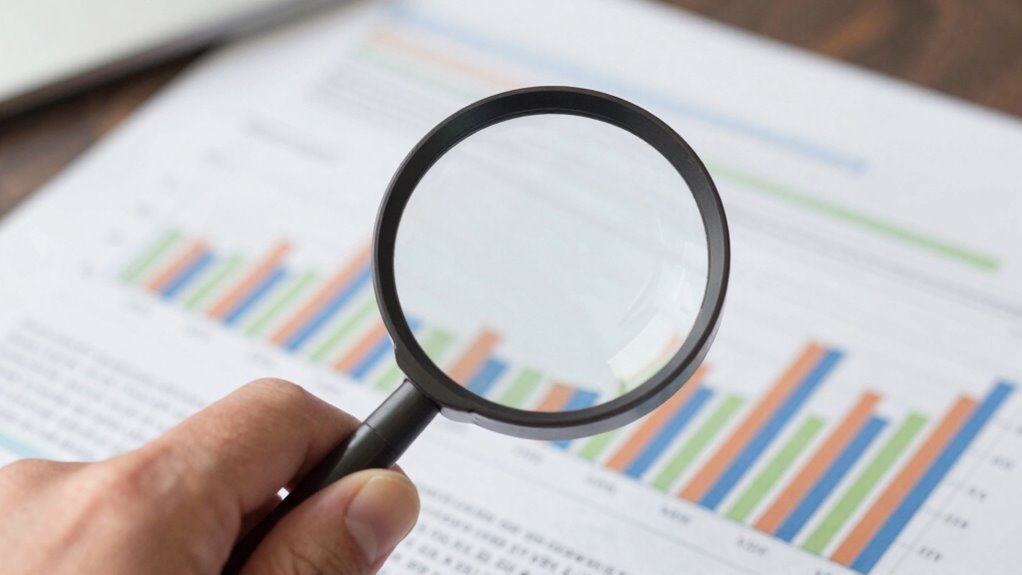
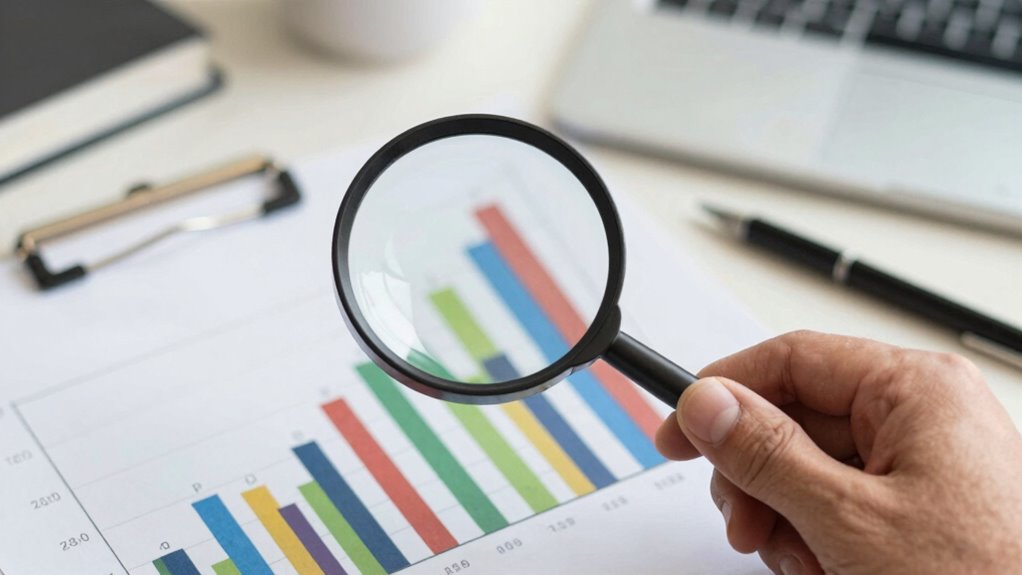
When you encounter a statistic that seems questionable or too good to be true, there’s a quick way to verify its credibility. Instead of taking it at face value, you can use a few simple steps to determine if the statistic is accurate or being twisted. The first step is to examine the data visualization associated with the claim. Well-designed graphs and charts can reveal a lot about how the data is presented. If a graph looks suspicious — like it exaggerates differences or uses misleading scales — that’s a red flag. Pay attention to what the axes represent and whether the visual emphasizes certain points over others. A distorted data visualization often aims to manipulate your perception, making a minor difference seem significant or vice versa.
Check graphs carefully for misleading scales and exaggerated differences to spot potential manipulation of data.
Next, focus on source credibility. Ask yourself where the statistic originates. Is it from a reputable organization, academic journal, or government agency? Or does it come from an anonymous blog or an unreliable website? If the source isn’t transparent about its methodology or has a history of spreading misinformation, you should be skeptical of its claims. Reliable sources usually provide detailed references and explain how they collected and analyzed their data. Cross-check the statistic with other trustworthy sources to see if they report similar figures. Multiple credible sources agreeing on a number make it more trustworthy; conflicting reports suggest you should dig deeper before accepting the claim.
You can also verify the context of the statistic. Sometimes, numbers are taken out of context or cherry-picked to support a specific agenda. Look for the original study or report and review the methodology. Understanding the sampling techniques and how data was gathered provide additional insight into its reliability. Check the sample size, time frame, and population involved—these factors influence how representative the statistic is. If the data was gathered from a small or biased sample, the statistic might not reflect the broader reality. When possible, read the actual study or report rather than relying solely on summaries or headlines. This helps you see if the statistic has been manipulated or misinterpreted. Additionally, understanding the data collection process can give you insight into the reliability of the statistic. Being aware of common misleading visualizations and how they can distort data is also essential to avoid falling victim to misleading information and to better evaluate the figures presented to you.

Good Charts Workbook: Tips, Tools, and Exercises for Making Better Data Visualizations
As an affiliate, we earn on qualifying purchases.
As an affiliate, we earn on qualifying purchases.
Frequently Asked Questions
How Can I Identify Biased Sources of Statistics?
To identify biased sources of statistics, assess their source credibility and look for data transparency. Check if the organization has a reputation for accuracy and unbiased reporting. Look for clear explanations of how data was collected and analyzed. Be cautious of sources that cherry-pick data or have a vested interest. Reliable sources openly share their methodology, making it easier for you to evaluate whether the statistics are trustworthy and unbiased.
What Are Common Signs of Manipulated Data Visuals?
Like a magician’s trick, manipulated visuals often hide data distortion through exaggerated scales, cherry-picked data, or misleading axes. Watch for visual misrepresentations that draw your eye unfairly, such as truncated axes or inconsistent units. If the graph’s appearance seems off or overly dramatic, it’s a sign someone might be distorting the data to push a specific narrative. Trust your instincts and scrutinize the visual cues carefully.
How Do Sample Sizes Affect Statistical Integrity?
Sample sizes greatly impact statistical integrity because small samples increase sampling errors, making your data less reliable. With larger samples, you better capture data variability, leading to more accurate results. Small samples can skew insights, while bigger ones reduce bias and improve representativeness. Always guarantee your sample size is adequate, so you minimize sampling errors and accurately reflect the true variability in your data.
Can Context Change the Interpretation of Statistics?
Yes, context influence can considerably change your interpretation of statistics. When you consider the background, source, or specific situation, interpretive shifts often occur, leading you to see the data differently. Without context, you might draw misleading conclusions. So, always ask yourself what surrounds the statistic—who collected it, why, and under what circumstances—to guarantee you’re interpreting it accurately and not falling for potential biases or misrepresentations.
What Tools Help Verify Statistical Authenticity Quickly?
Imagine having superhero tools at your fingertips! Data triangulation and statistical cross-checking are your ultimate allies, helping you verify quick truths. Data triangulation cross-verifies data from multiple sources, while statistical cross-checking compares figures to spot inconsistencies. These tools act like magnifying glasses, revealing hidden twists and ensuring the stats you trust are authentic. With them, you can confidently cut through misinformation and get to the real story swiftly.
![DeskFX Free Audio Effects & Audio Enhancer Software [PC Download]](https://m.media-amazon.com/images/I/41fXbDohyuS._SL500_.jpg)
DeskFX Free Audio Effects & Audio Enhancer Software [PC Download]
Transform audio playing via your speakers and headphones
As an affiliate, we earn on qualifying purchases.
As an affiliate, we earn on qualifying purchases.
Conclusion
Next time you see a striking statistic, remember to dig a little deeper. For example, consider the claim that “80% of people do yoga.” While impressive, it might not account for sampling bias or how the question was asked. By questioning the context and source, you protect yourself from being misled. Always stay curious and skeptical—statistics can reveal truths or distort realities, depending on how they’re presented.

Architectural Scale Ruler, Imperial Measurements 12'', Laser-Etched Aluminum Architect Triangular Ruler Black for Architects, Students, Draftsman, and Engineers by mveohos
[PREMIUM QUALITY] This engineering triangle scale is made of anodized aluminum alloy, very solid and sturdy. Designed for…
As an affiliate, we earn on qualifying purchases.
As an affiliate, we earn on qualifying purchases.
data source credibility checker
As an affiliate, we earn on qualifying purchases.
As an affiliate, we earn on qualifying purchases.