
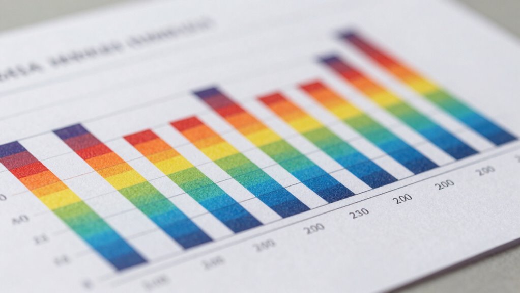
When a chart looks convincing, start by verifying the source’s credibility to guarantee it’s trustworthy and free from bias. Then, check the axes and scales; make sure labels are clear, scales start at zero, and there’s no distortion. Also, examine the visual elements—colors and labels—for fairness and clarity. Confirm that the data makes sense within its context and watch for gaps or inconsistencies. If you keep exploring, you’ll uncover more ways to spot the truth behind the visuals.
Key Takeaways
- Verify the data source’s credibility and transparency to ensure reliable information.
- Examine axes labels, scales, and intervals for accuracy and proper proportionality.
- Assess visual elements like colors and labels for fairness and clarity.
- Confirm that the data aligns logically with the chart’s context and intended message.
- Look for missing data, anomalies, or inconsistencies that may distort the interpretation.
Mikolo Smith Machine with Weight Stack, Power Cage Home Gym System with LAT Pulldown & Cable Crossover, Multi-Functional Trainer with Dual Pulley System, BP 230lbs
【Innovative Pulley Configuration】 The Mikolo Smith Machine features an innovative pulley configuration that achieves a 2:1 ratio for...
As an affiliate, we earn on qualifying purchases.
Is the Data Source Trustworthy?
Before relying on a chart, you need to determine if the data source is trustworthy. Check the source credibility by researching where the data originated. Is it from a reputable organization, academic institution, or government agency? Avoid sources with questionable motives or those known for bias detection issues. Be cautious of sources that might present selective data or have a vested interest in influencing your opinion. Reliable sources typically cite their data clearly and follow transparent research methods. If the source seems biased or lacks transparency, the chart’s information could be misleading. Trustworthy data sources help you make informed decisions, so taking a moment to verify credibility safeguards you from false impressions and ensures your analysis remains accurate. Additionally, assessing whether the data aligns with industry standards can further confirm its reliability. Verifying the data collection methods used can also provide insight into its accuracy and consistency. Checking if the source adheres to established ethical research practices is also important to ensure the data’s integrity. A thorough review of the source’s reputation within the field can offer additional assurance of its trustworthiness. Furthermore, examining the historical context of the data can help determine its relevance and validity over time.
Amazon Product B0FQ4VQGBW
As an affiliate, we earn on qualifying purchases.
How Do the Axes and Scales Look?
Once you’ve confirmed that the data source is trustworthy, it’s time to examine the chart itself, starting with the axes and scales. Pay close attention to axis labeling—are they clear and correctly labeled? Check the scale accuracy: are the intervals consistent and proportional? Misleading scales can distort your perception of the data. Here are four key points to contemplate: 1. Are axis labels descriptive and easy to understand? 2. Do the scales start at zero or are they truncated, potentially exaggerating differences? 3. Are the intervals uniform, avoiding misleading impressions? 4. Is there any manipulation of the axes that skews the data interpretation? Additionally, understanding the interpretation of scales can help you better assess the chart’s reliability. Recognizing visual distortion techniques can further illuminate whether the chart intentionally or unintentionally misleads viewers. Being aware of common graphical manipulation tactics enables you to critically evaluate the data presentation and avoid being deceived. Moreover, applying critical thinking to the chart’s structure can significantly enhance your ability to detect subtle inaccuracies. Developing an eye for graphical integrity can help you distinguish honest data from manipulated visuals.

DJI Mini 3 (DJI RC), Lightweight 3x Mechanical Gimbal Drones with Camera for Adults 4K, 38-min Flight Time, up to 32800ft (10km) Video Transmission, Vertical Shooting, GPS Auto Return Integrated
No Registration Needed - Under 249 g, FAA Registration, and Remote ID are not required if you fly...
As an affiliate, we earn on qualifying purchases.
Are Visual Elements Fair and Clear?
Visual elements such as colors, labels, and symbols should be straightforward and honestly represent the data. Pay close attention to color schemes—they should enhance understanding without misleading or distracting. Avoid overly bright or clashing colors that can confuse viewers or obscure key points. Labels must be clear and precise; ambiguous or cluttered labels undermine the chart’s credibility. Check that all labels are easy to read and accurately describe what they represent. Symbols used should be intuitive and consistent throughout the chart. If visual elements are confusing or biased, they can distort the data’s message. Fair and clear visual elements help you quickly grasp the story the chart is telling, making it easier to evaluate its reliability and interpret the information accurately. Additionally, considering ventilation considerations in your visual data can improve the overall clarity and safety of your sauna and cold plunge setup. Ensuring that charts incorporate air purifier maintenance information can also aid in presenting a comprehensive view of air quality management. Being aware of potential visual biases helps in critically assessing whether the chart truly reflects the data without unintended influence. Furthermore, paying attention to data source credibility can strengthen your confidence in the information presented. Incorporating accurate data representations ensures that the visual elements communicate the intended message effectively.

DJI Mini 4K, Drone with 4K UHD Camera for Adults, Under 249 g, 3-Axis Gimbal Stabilization, 10km Video Transmission, Auto Return, Wind Resistance, 1 Battery for 31-Min Max Flight Time
No Registration Needed - Under 249 g, this drone with camera for adults 4K does not require FAA...
As an affiliate, we earn on qualifying purchases.
Does the Data Context Make Sense?

To determine if the data context makes sense, you need to contemplate whether the data aligns with the broader situation or topic it addresses. Verifying the contextual relevance of the data helps confirm it’s appropriate for the chart’s message. Check if the data aligns with what you expect based on the scenario. Ask yourself:
- Does the data reflect the relevant timeframe?
- Is it appropriate for the industry or subject?
- Are the units of measurement consistent?
- Does the data support the story the chart aims to tell?
- Understanding data accuracy is essential to ensure the data’s integrity and that it truly represents the situation. Additionally, considering the Gold IRA markets can provide context for evaluating the relevance of the data. Recognizing data validity is also crucial to avoid relying on incorrect or outdated information that might skew your interpretation. Confirming the data source credibility can also help verify the trustworthiness of the data. If these elements don’t match the context, the data may be misleading or misinterpreted. Confirming data alignment and contextual relevance ensures you’re interpreting the chart correctly and avoids drawing false conclusions.
Are Any Data Gaps or Inconsistencies Present?
Before drawing conclusions from a chart, verifying for any data gaps or inconsistencies that could affect its accuracy is vital. Data gaps occur when information is missing, which can mislead your interpretation. Inconsistency checks help identify anomalies, such as sudden jumps or drops that don’t align with the overall trend. Carefully examine the data points and labels to spot any gaps or irregularities. If you notice missing data or conflicting information, question the chart’s reliability. Addressing these issues ensures you’re not misled by incomplete or flawed visuals. Remember, a convincing-looking chart can still hide inaccuracies. Conduct thorough inconsistency checks to confirm the integrity of the data before trusting or sharing the chart’s message. Additionally, understanding data visualization best practices helps ensure your interpretations are based on accurate and complete information.
Frequently Asked Questions
Could the Chart Be Intentionally Misleading?
Yes, the chart could be intentionally misleading. You should watch out for visual illusions that distort perception, making data seem different from reality. Misleading labels can also hide the true message or exaggerate differences. Always question the scale, labels, and visual elements, as these can be manipulated to create a false impression. By critically examining these factors, you can avoid being fooled by intentionally deceptive charts.
Has the Data Been Independently Verified?
You should verify the data’s authenticity by checking if it’s been independently verified. Look for source verification, which confirms the data comes from reputable and unbiased sources. If the data hasn’t been independently validated, be cautious, as it might not be reliable. Ensuring source verification helps you assess whether the information is trustworthy and prevents you from being misled by potentially false or manipulated data.
Are There Any Hidden Biases Influencing the Chart?
You should look for hidden biases like visual bias or color manipulation that can skew your perception. Check if the chart uses misleading colors or exaggerated scales to emphasize certain data points. These tactics can distort the truth, making the information seem more convincing than it truly is. By being aware of visual bias and color manipulation, you guarantee you’re not misled by deceptive visual techniques.
Does the Chart Compare Appropriate Datasets?
Of course, you should always verify if the chart compares appropriate datasets, even when it looks convincing. Sadly, data misrepresentation and visual distortion happen all the time, making charts seem more persuasive than they really are. You might be fooled into believing a trend that isn’t real. So, take a moment to check if the datasets are relevant and comparable, rather than just relying on the chart’s visual appeal.
Is the Chart Updated With the Latest Data?
You should verify if the chart is updated with the latest data to guarantee data freshness. Outdated information can mislead your analysis. Look for the date or timestamp on the chart to confirm it reflects recent data. Also, assess visual clarity—clear labels, legends, and consistent scales help you interpret the data accurately. Prioritizing updated data and clear visuals ensures your conclusions are based on the most current and understandable information.
Conclusion
When a chart looks convincing, don’t just take it at face value—you’re better off digging a little deeper. Check the data source, examine the axes and scales, and verify the visuals are fair and clear. If something feels off, trust your gut and look for gaps or inconsistencies. Remember, a convincing chart can be like a wolf in sheep’s clothing, so always stay one step ahead and see through the facade before drawing conclusions.